
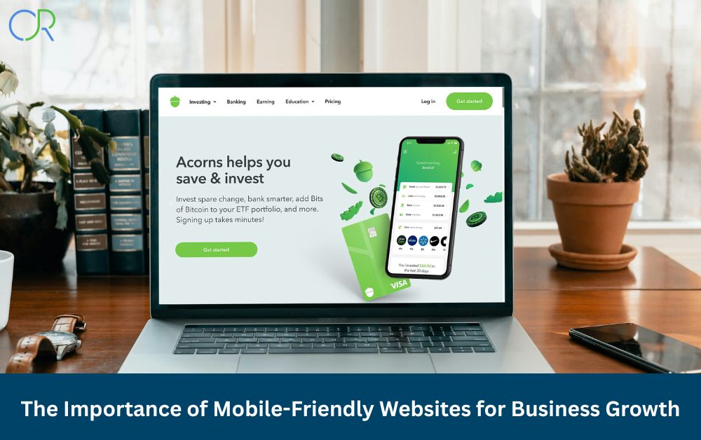
Is your website mobile-friendly? Learn why having a mobile-optimized site is crucial for business growth, better user experience, and higher Google rankings.
Let’s Bust a Common Myth First
A lot of people still believe that having a website that looks good on a desktop is enough. Sorry to break it to you—it’s not. In today’s world, your visitors aren’t sitting behind a computer screen all the time. They’re browsing on their phones while waiting for coffee or scrolling on tablets during lunch breaks. So, if your site isn’t mobile-friendly, you’re already losing a chunk of your audience.
What Is a Mobile-Friendly Website, Anyway?
Okay, so let’s break it down. A mobile-friendly (or mobile-optimized) website is one that works perfectly on smartphones and tablets. It looks good, loads fast, and is easy to navigate without zooming or pinching. It uses responsive design, meaning the layout adjusts itself based on the screen size. Whether someone’s on an iPhone or a tablet, everything just fits.
Why Mobile-Optimized Sites Matter for Business Growth
This part is big. If your website isn’t mobile-ready, you’re not just annoying users, you’re hurting your business. Here’s why:
- Better user experience: Nobody wants to struggle with tiny buttons or messed-up layouts.
- Lower bounce rates: People stay longer when the site is easy to use.
- Faster page speed: A mobile-optimized site loads quicker, and that’s great for both users and search engines.
- More conversions: Whether it’s signing up for a service or making a purchase, mobile-friendly design helps boost action.
- Higher mobile search rankings: Google ranks mobile-optimized websites higher. Simple as that.
Mobile-Friendly = SEO-Friendly
Here’s the deal: Google uses mobile-first indexing. That means it looks at the mobile version of your site first when deciding where to place you in search results. If your mobile site sucks, your SEO suffers.
Things like page speed, responsive design, and user engagement all play a role in mobile SEO. So yeah, mobile-friendliness isn’t just about the look, it impacts how you rank.
What Happens If Your Site Isn’t Mobile-Friendly?
Brace yourself:
- Your site looks bad on phones.
- People leave faster (high bounce rate).
- Your rankings drop.
- Your conversions tank.
- You lose credibility, especially with new visitors.
It’s basically like turning away customers at your store’s front door. Not a good look.
Real Growth Comes from Mobile Optimization
Let’s talk numbers. A mobile-optimized website brings more traffic and converts more visitors. Especially if you run a local or small business, your mobile site is the first impression for many customers.
Think about it: people search on mobile all the time. Whether they’re looking for a nearby store, service, or product, they’re likely on their phones. If your site loads fast and works well, you’re ahead of the game.
Plus, mobile-friendly websites build trust. They feel more professional and are easier to use. That builds credibility, and credibility builds sales.
How to Make Your Website Mobile-Friendly (Without Losing Your Mind)
Here are a few quick wins:
- Use a responsive theme or design: Your layout should adjust to any screen size.
- Optimize images: Smaller image sizes = faster loading.
- Make buttons and links big enough: No one wants to accidentally click the wrong thing.
- Speed things up: Use caching, compress files, and clean up your code.
- Test on real devices: Don’t just guess. Try your site on different phones and tablets.
- Use Google’s Mobile-Friendly Test: It’s free and super helpful.
Real-World Examples of Mobile-Friendly Done Right
Want to see what good looks like? Think clean layouts, fast load times, big buttons, and clear calls to action.
Some eCommerce sites, for example, make it ridiculously easy to shop on a phone. You can browse, filter, and check out without a single hiccup. That’s the goal. Clear design, mobile-first features, and no fuss.
Final Thoughts: Go Mobile or Get Left Behind
In the end, it’s simple. If your website isn’t mobile-friendly, you’re leaving money on the table. People want fast, smooth, and easy-to-use websites—especially on mobile.
Your competitors are already optimizing for mobile. Don’t wait until you’re invisible in search results. Act now, update your site, and keep your business moving forward.
FAQs: All About Mobile-Friendly Websites
Q1: What does mobile-friendly really mean?
It means your site works well on phones and tablets—fast loading, easy navigation, readable text, and all that good stuff.
Q2: Is mobile-friendly the same as responsive design?
Pretty much, yes. Responsive design is how we usually build mobile-friendly websites. It adjusts the layout based on screen size.
Q3: How can I test if my website is mobile-friendly?
Use Google’s Mobile-Friendly Test. Just pop in your URL and it tells you what’s working and what’s not.
Q4: Why is mobile speed so important?
Because people are impatient. If your site takes forever to load on mobile, they’ll bounce. And Google notices that too.
Q5: Can a mobile-friendly site really boost my sales?
Absolutely. A smooth mobile experience keeps people engaged, builds trust, and increases conversions—which means more sales.
Q6: Do I need a separate mobile site?
Not usually. A responsive design works across all devices, so you only need one version of your website.
Q7: What if most of my traffic is desktop?
Even if that’s true today, it might not be tomorrow. Mobile use keeps growing. Better to future-proof your site now.
Q8: Does mobile-friendliness affect Google rankings?
Yes, 100%. Google prefers mobile-optimized websites and uses mobile-first indexing for ranking.